This is a follow-on post to the one I did a few days ago on using Crazy Egg to get a graphical representation of your blog traffic hits over time.
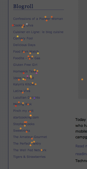
I just wanted to share a couple of nano-epiphanies I have had after looking at where people click on my main page. Note that while a huge amount of my traffic links directly and deeply into the blog without ever going to the front page (google search and google image hits), the elements I have focused on here are shown on each and every page load (wordpress uses PHP to dynamically serve content). I have put the script in the footer php so that it monitors every page that includes that footer (as in every page on the blog).
Epiphany 1: Blogrolls DO matter and they get quite a lot more hits than I ever expected.
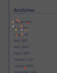
Epiphany 2: People really DO like to use the archive section for navigation.
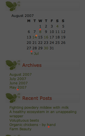
I looked at my gardening blog Humble Garden which uses a calendar as well as an archive section to see if there is a preference. As this is a brand new blog, sample size is not huge but perhaps there is an indication here that the calendar with clickable dates is a usable and useful design element.
Epiphany 3: People DO use my search bar, a whole LOT. - if you have one, you better make sure it works! You can also see that people are browsing as well with the nav bar above the search box.
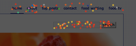
Epiphany 4: Put your search box near the top and near the "browsable" navigation bar at the top in case a person can not find what they want with their search terms.
Epiphany 5: (Last one) Make sure to have a link at the bottom to the next page so that people can keep browsing without having to search and search for the archive or some other way of finding older posts. I personally go nuts when I am cruising a neat new blog and then cant find that older posts or next page button.
I hope I have not bored the pants off of you!
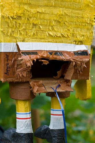
You can tell here that Spongebob Squarepants was not at all impressed with this post :-), his pants have been bored right off. These are the hazards of blogging.
This Post was written by Nika from Nika's Culinaria and Humble Garden.
14 comments:
Thanks so much for that analysis, Nika. In regard to #5, does anyone know how to add next and previous posts links in classic Blogger? I've been trying off and on for a week to find out without any luck. I'm not on a New Blogger template, so I can't use a widget.
Thanks Nika. I have try adding Google search bar (twice) and sent the appropriate link off to Google. They have obviously decided not to action it. Does anyone know if there are there are other search bars I could use.
Interesting analysis, Nika. Thanks. I use WordPress, too, but hadn't gotten around to trying the heat map yet. Based on your epiphanies, I feel fairly OK about my pages, but I'll take another look at my blogroll (which I have as "favorite links").
Thank you for your interesting information. I am going to look into putting a search bar on my blog.
Nika, you crack me up. Thanks for all your hard work! :)
All: hey I am glad you all find it interesting and of use.
Because it is so easy to move sidebar elements around with my wigedtized template, I sometimes wanna just dump everything for a "cleaner" look.
Maybe one day I will dump it all and write one post that says "Dude, just google cache me"
This analysis has stayed my deleting wand.
I am sorry that I cant help with blogger specific things re: search!
[Cate - glad you cracked up :-)) but it wasnt hard work!]
All of this said, I am still working out in my mind what to think about the blogroll. It represents traffic that is LEAVING my site. It represents "good will" with the bloggers I link to (I suppose, unless the blogger never looks at their stats, something that the highest hit-getting blogroll blog admits to).
What else does it represent :-/..
There is supposedly merit to having high PR outgoing links (tho not supposedly as highly weighted as high PR incoming links). In theory, one could load one's blogroll with only high PR blogs (101 cookbooks, etc) simply to boost one's own PR.
I see the blogroll as my recommendations (I am sure most people see it this way) and not just a list of links for myself or a way for me to build PR.
Nika, thanks again for sharing this info. I found out the same things you did with my testing, and was really surprised with how many people use the links in the sidebar.
It was also interesting to find that on my blog, many people were trying to click on something that wasn't a link at all, so I made it a link and made a lot of people happy.
I highly recommend that every blogger take a few days and run this test- it's very enlightening.
very interesting - thanks for your post!
Erika: Ooh, I adore your blog template. Any thing LOTR or Hobbit has my vote :-)
Its great that you picked up on something like that. What was it they were trying to click?
Nika, I put all my recipes on a separate blog, and I put a little note in my sidebar directing people to head over to my recipe collection if they were looking for a recipe. The link was directly above, but still, people were trying to click on my little blurb instead, so I made it a link anyways and now the traffic to my recipe site has gone way up as well.
The most surprising one to me though is the blogroll. I'm just not sure how to use that to my advantage. :-)
Hi Nika, this is a very interesting insight, I will have to try this on my own blog... I was about to delete a whole lot of content, but I better look deeper into it before I get rid of something people tend to use a lot! lots of epiphanies for me, too! thanks for sharing this!
What surprises me on the blogrolls is the blogs that don't open those links in a new window or tab... This allows a reader to go see another site while remaining on your site, eventually coming back to explore some more.
I have to look at the crazy egg thing a bit more; with Typepad, it seems to be missing a lot of stuff.
"What surprises me on the blogrolls is the blogs that don't open those links in a new window or tab... This allows a reader to go see another site while remaining on your site, eventually coming back to explore some more."
Well, people can simply right click and open in a new window or tab. I don't like to make too many windows for people. I assume when they click on a blogroll to go to another site they want to leave and I let them go.
Does anyone else have any feelings on links using "target=blank"?
I asked about this once and was told that "sticky" was Web 1.0 and that the old thinking was keep them on your site at all costs. Web 2.0 is control and freedom and anyone knows how to open a new window or tab.
Apparently you can't do an "Older posts" or "next page" in Typepad, which is really backwards in my opinion.
Post a Comment